Responsive CPQ
CallidusCloud, year 2015
CPQ is a business application that allows you to quickly configure, price, quote, propose, and sell your offerings. We already had an outdated product but we needed to make it work on any device.

The challenge
Responsive or native?
I got together waith CPQ team to discuss how to make our product work on any device. Our clients mostly used iPads, but also android phones and iPhones and when travelling and it was important for them to be able to make deals on the go. I presented three possibilities: Native, Hybrid or Responsive and we took some time to consider all three. There were many pros and cons for each so making a decision was not easy.
The biggest issue with going Native was, of course, lack of resources as we didn't have any developers that could tackle this in the time needed. Hiring hew people was not always as easy, and the deadline for new product release was already announced and it was looming over us. We decided to make it responsive as the first step and then see if it makes sense investing in building native applications.
My Role
- analyzing and defining problems with the current UI
- creating sketches and wireframes
- internal usability testing
- creating responsive pages in HTML and CSS with a bit of KnockoutJS
The approach
Making it responsive is not enough
The main goal of rewriting the whole product was to make it work faster and be scaleable for any device. No other improvements were planned, but since the product was ten years old and features were constantly added to it and our users struggled a lot using outdated user interface, we wanted to make sure user experience was also improved.
This meant more time would be needed and more resources would have to be involved which was not something management was happy about. I worked as an only UX designer on this project and had to constantly navigate between product managers and developers to make sure everything is going accoring to the plan.
Usability improvements
Since we got the green light to improve the product from functional point of view as well rather than just "pretty it up" and make it responsive, it was hard to decide what to concentrate on. There were so many things that needed to be improved and we had a lot of documentation we gathered from usability testing and user research we've done over the years. Most of our user pain points were already well known to us, it was only a matter of combining everything into an actionable document.
Since this project was just as big from the development perspective, I worked closely with development teams from the beginning which allowed us to work in parallel, so we were able to produce things faster.
Pick something but do it right
The hardest part was rewriting the admin side of the product and making it reponsive since a lot of features accumulated over the years. We knew we had to prioritize. I managed to combine top pain points from various different sources and rewrote them into "who is doing what and why" point of views. These contained the most common tasks our users had to set up on a daily basis. Still there were too many action points and our time was limited.
We decided to plot each big cluster of POVs into an impact grid and concentrate only on those parts that had high impact and were easy to do from development perspective. Easy for us this time meant something that could be finished by the time release was planned.
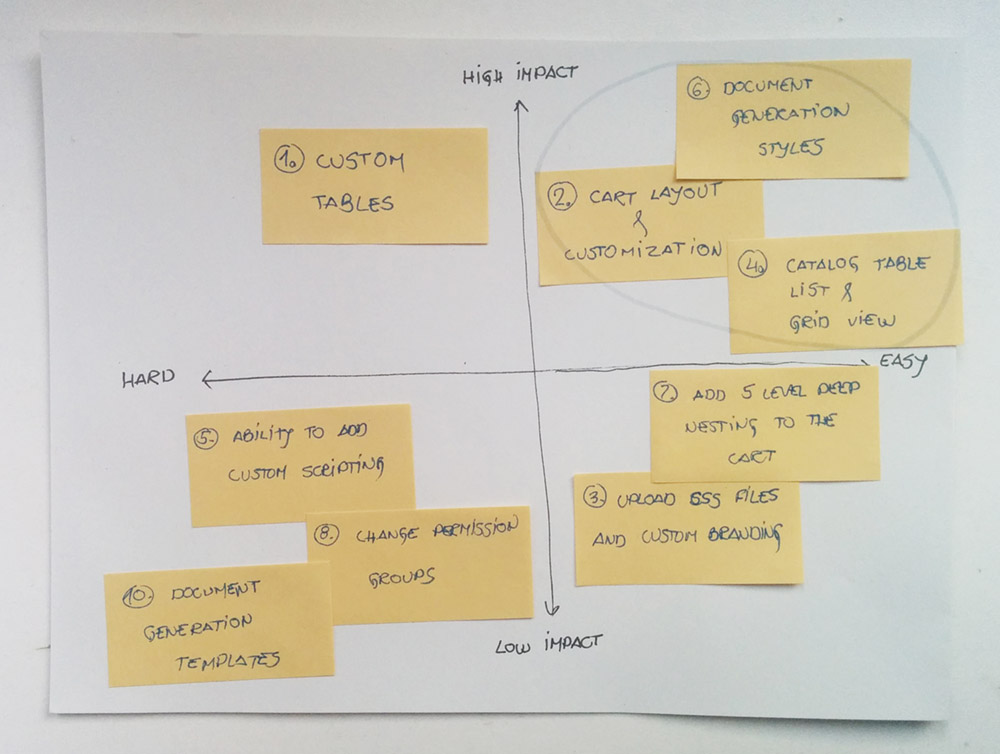
prioritizing ideas using impact and feasibility
Test and move on
Concentrating only on certain things also gave me more time to do some quick and dirty internal testing of the improvements we were planning to make. Since we didn't have enough time we skipped the prototyping phase and from tested wireframes went straight to coding. Since by this time we already had a design system in place, this was not a big problem.
Final results
Successful launch
After successful launch, even though not a lot was changed from functional or even usability point of view, the new look, ability to use product on the go and small improvements made our clients happy and excited to try out the new product. We made it possible for them to also go back to the old product for any missing functionalities.
We had a busy next few releases testing the changes with our clients and rewriting the rest of the product making sure everyone had enough time to adjust.
Key Learnings and Takeaways
Even though picking the responsive approach might not have been ideal for such complex product, It was impressive to see how fast certain changes can be made with limited resources dedicated to one task. Among other things, I learned:
- How to cope with tight deadlines
- How to coordinate within a big team
- How rewarding it is to meet users' expectations
- Even small changes go a long way if executed right