Design System
CallidusCloud, year 2017
We wanted to build a design system in order to maintain consistency across different products and different teams. But in reality, our end goal was to help our users.

The challenge
What was consistency, again?
As a cloud company we had many different products - some developed in house and some bought - and the number kept increasing. They all looked different, served different needs and even worked under different platforms. It was really hard to have a strong brand and make users associate all these products with the same company. Our development teams were struggling to implement different UI solutions for the same problem, and our users were struggling to learn how to use all these different products. The consistency in user interface and user experience was something we could only dream about.
The two of us designers got together with the product manager and asked ourselves two questions:
- How to make a design system that is flexible enough but will still allow us to unify certain things.
- How to involve every stakeholder and get everyone on the same page as to what we want to achieve, why this is important, and how each stakeholder can contribute.
My Role
- doing a heuristic review of the products
- conducting stakeholder interviews
- mapping different UI elements into atomic design system
- writing HTML/CSS code for each element
- doing usability testing of new UI solutions
The approach
Documenting and more documenting
We knew very well what we needed to do. First, together with marketing and branding teams, we created a visual design language that consisted of colors, typography, sizing, spacing and icons. This wasn’t really hard since the company already had some basic guidelines in place so we only needed to agree on how we see the new visual language and what needs to be improved. We documented everything in a better way and made it a company’s standard so every stakeholder could be aware of the change.
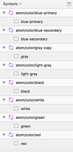
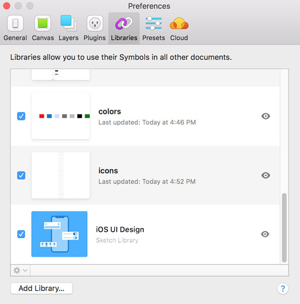
sketch symbol libraries
Atomic Design
The hardest part though, was identifying all the different UI patterns used across all products, starting from simple buttons to the very complex user interface components and pages. We needed a clear methodology for crafting our design system, so for mapping the UI elements, we decided to use the atomic design approach. The biggest advantage of this approach for our complex systems was the ability to easily mix and match components and make code more consistent by using modules.
We documented each pattern and mapped it as atom, molecule, organism, template or page. We also described each pattern and provided documentation on when and how it should be used.
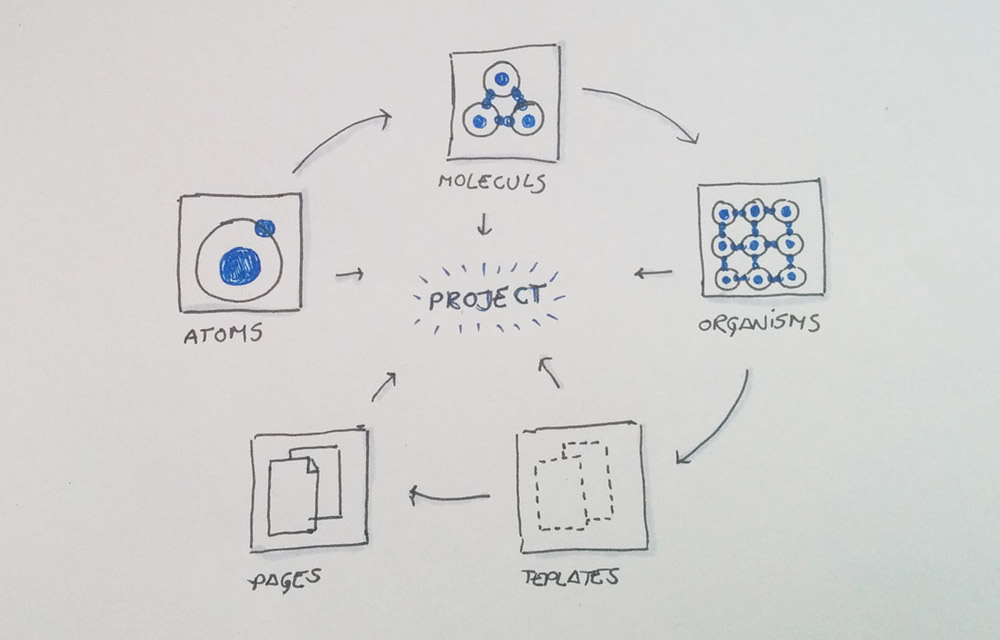
atomic design system in a nutshell
Improving usability
Apart from making things consistent, we saw this as a perfect opportunity to work on improving the user experience as well. We conducted a heuristic evaluation of each product, having in mind ten usability heuristics for user interface design by Jakob Nielsen. We documented each UI pattern that had a usability problem that needed to be addressed, assigned severity points, added recommendation and other details and had everyone assign issues to themselves and track progress.
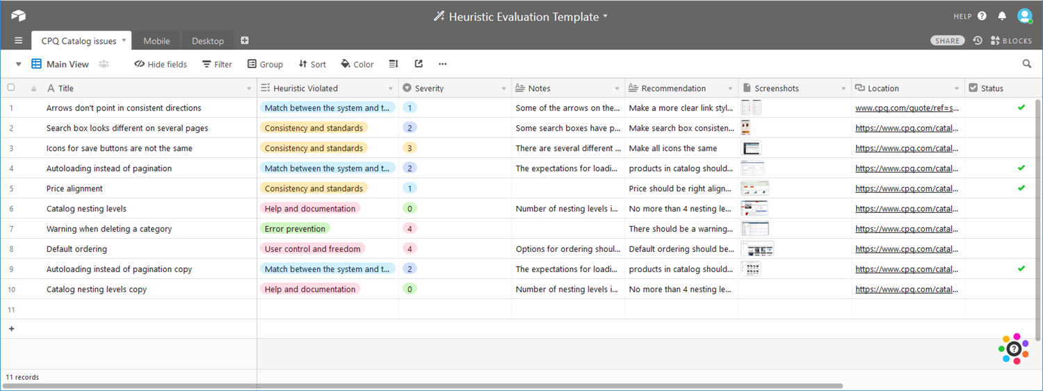
heuristic evaluation spreadsheet
The presentation
Final results
Having a design system in place sped up the development process and clients were finally able to see all our products as part of the same bundle with unique branding and consistent UI. The process itself took a long time - for the first phase we had a set of most common elements used across products and the system kept evolving from there. Applying the system to some outdated interfaces was a challenge on its own, and the transition period took a while but it paid off in the end.
Key Learnings and Takeaways
This project was very specific since it involved different products and different teams in order to make it all happen. I learned a lot of things:
- Appreciate team work
- Big things take time - patience and organization is super important
- No amount of documentation is too much
- When communicating benefits with stakeholders use their language