OpenPuzzles
Freelance project, year 2016
OpenPuzzles is a cloud solution that automates the business process. It helps develop structure and manage project deliverables in a modern and automated way.

The challenge
Budget and time as our biggest enemies
There were only three of us working on this project - a developer, a project manager and myself. All three of us lived in different cities and even different countries, so the collaboration was mostly happening online. This made communication very hard.
We had very little documentation based on research done by project manager who already knew the company that would buy the end product and didn't have enough time or resources to spend on proper user research. It was hard for me to completely understand the product and all of its features, but the time and budget for exploration were very limited.
My Role
- researching the competition
- interviewing internal stakeholders
- creating application architecture
- sketching wireframes and defining visual guidelines
- creating responsive HTML and CSS pages
The approach
How can we stand out?
To make users want to buy and use the product, we had to figure out what we should offer in order to stand out. I did research of the competition, and the market was full of similar solutions so it wasn't all that hard to understand what features users expected to see. I interviewed only a few people who project manager knew would use the product, to understand their expectations.
Based on this, we made a list of features/ideas and in order to prioritize them and measure user's satisfaction levels I decided to use the Kano Model. By asking people to rate how they would feel with and without that feature and plotting their answers on Kano evaluation table we were able to separate all ideas between basic needs, performance needs and delighters.
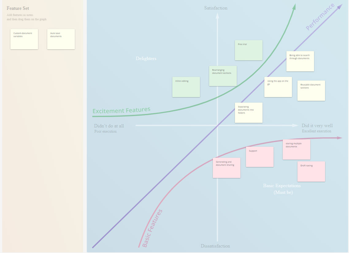
Evaluating set of features using Kano model
Application architecture
We spent a lot of time trying to understand and come up with application architecture that would cover all possible user journeys. We were constantly going back and forth and made a lot of mistakes due to misunderstandings and project complexity.
We knew what our MVP was supposed to look like, but we also wanted to include the admin side (which was supposed to happen in phase two of the development process). It was important to include this in the application architecture from the beginning to see how it would be connected to the rest of the journey.
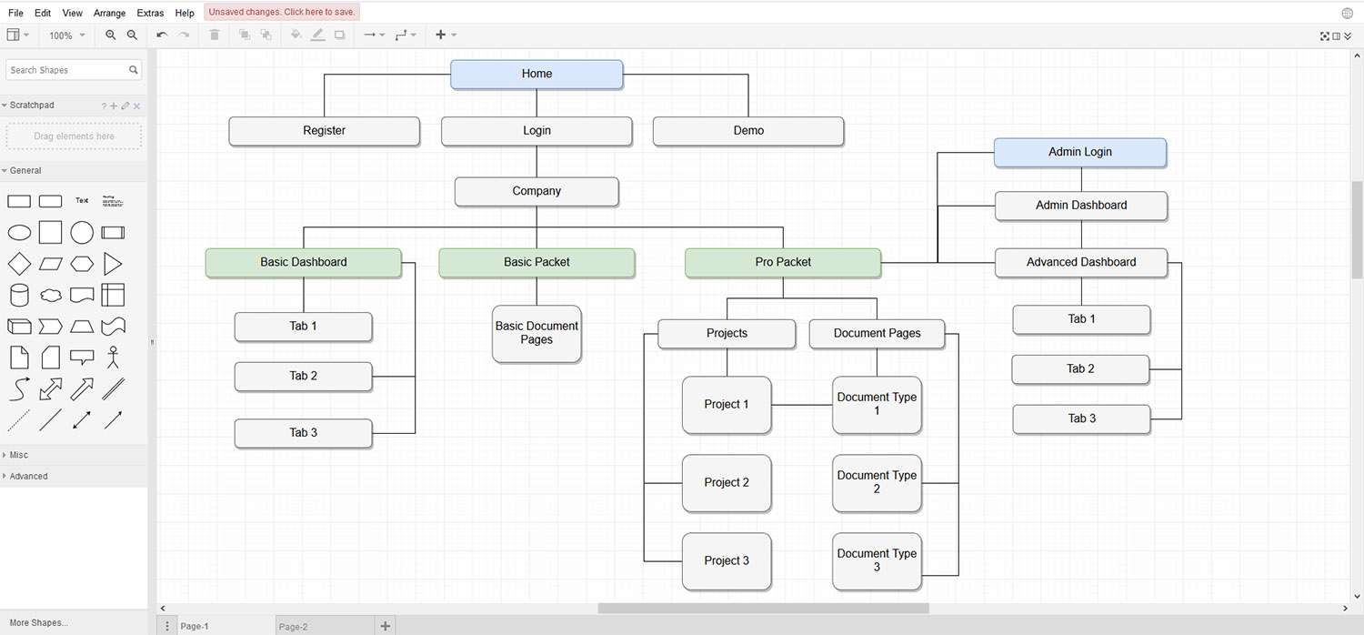
application architecture including admin side
Wireframes as an essential part
Creating click-through wireframes of the journey was very helpful to move forward as seeing something visually brought a lot of new questions and dilemmas. Also it was much easier to change things in this phase and iterate before spending time on high fidelity prototypes and actual development.
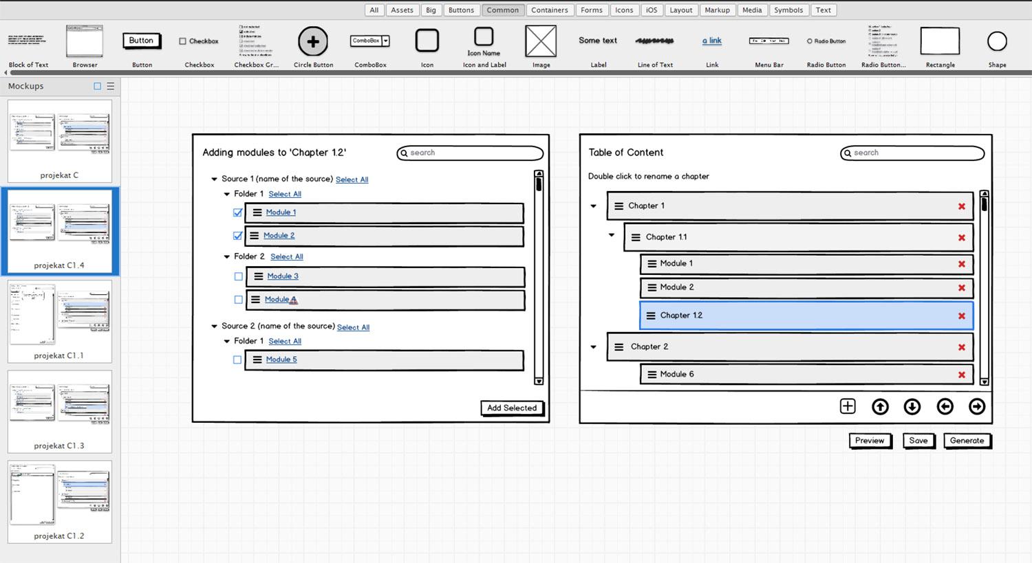
click-through wireframes to better understand the concept
High Fidelity prototypes
There was only enough time for high fidelity prototypes of the few main pages. When we reached an agreement on the basics of design style and language, I came up with a color palette and visual guidelines and went straight to coding. I used bootstrap framework to speed up the process and be able to quickly hand work over to the back-end developer.
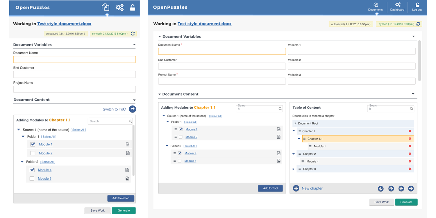
responsive high fidelity prototype of the main screen
Final results
Finding the clients
The product was successfully launched before the deadline and was presented in a conference before the potential clients and investors. However, apart from the inital client it was hard to find the other ones who would be interested in buying the product. Product manager spent some time promoting it and I created a product landing page with clear selling points and an easy way to start a free trial or request the demo.
Key Learnings and Takeaways
The most interesting learning I got out of this project was that it was actually possible to create a product relying only on internal stakeholders and their expertise and a limited number of end users. As a UX designer, I was not very proud of this approach and there are many things I learned:
- The idea for the product should come out of user needs
- Put the user in the center of everything you do
- Know your target audience, you are not the user
- Know what features go into your MVP and why
- Always wireframe, it's easier to discard and less time spent