Measuring UX
CloudWatch (AWS), year 2022
Coming up with a plan and measuring UX in a more strategic way
The challenge
Quantifying UX
For a long time the UX team has been relying on two criteria as our primary KPIs: Customer satisfaction score and positive feedback sentiment. Customer satisfaction score was an NPS score (customers were asked to rate the service every once in a while) and positive feedback sentiment was the number of positive feedback we were getting through the console. Over time, the number of services was growing and CloudWatch become a one stop tool for many different things. This made one overall score more or less meaningless as we couldn't tell which services were performing well and which ones users were struggling with. Likewise, the feedback we were getting was mostly negative as users were more likely to leave a comment when they wanted to complain. As a result of this it was difficult to understand what we had to improve in order to impact our KPIs.
There were three big challenges we faced:
- Come up with a good measurement strategy and automatize it
- Define the flows in a tool that does many different things most of which can be done in multiple different ways
- Secure development capacity to put the plan in action
My Role
- Getting the buy in from leadership team
- Defining the measurement strategy and plan
- Collaboratively mapping out main workflows with stakeholders
- Preparing and running a survey
- Finding ways to automatize feedback collection
- Conducting customer calls
The approach
Getting the buy in from leadership team
At the start of every quarter the leadership team would prioritize the different initiatives and project proposals from each team. Depending on the priority and capacity some projects would get in and others would get dropped. I got this idea early on, and to ensure we get capacity to tackle the problem of measuring UX, I prepared a doc outlying the problem and proposing a plan with activities and timelines.
I met with key stakeholders before the planning session to share the plan and gather some feedback to ensure the plan will be given a go ahead. My first proposal was more research and measuring oriented but I got feedback that we needed to make it more actionable and have clear deliverables at the end of the quarter and a plan for the next one. I added a road map and more tangible deliverables as well as support I'll need from other teams to keep the project running. The project ended up being prioritized and I started working on the more detailed measurement strategy.
Defining the measurement strategy
As this was my own initiative, there was no capacity for any PM support so I had to lead the project myself. I started by putting together a more detailed plan for measuring the UX which covered the following:
- Criteria for measuring UX
- Plan around what we want to measure
- Different ways of measuring with pros and cons
- Deep dive to understand the "why"
- Deliverables and next steps
Criteria for measuring UX
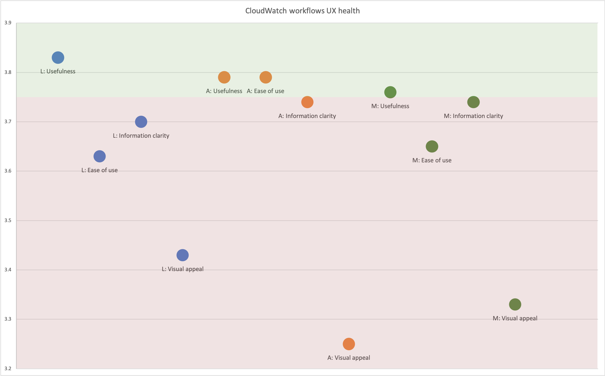
Measuring UX was something I was really passionate about and I was reading a lot about it previously so the problem wasn't new to me. We needed new scores that would better break the satisfaction down into several meaningful criteria and we needed those scores on a service and task level.I started with a simple measuring mechanism that would provide global scores for each user workflow taking into account the following criteria: Ease of use, Usefulness, Visual appeal and Information clarity.
We wanted to keep it simple and only focus on the most important criteria, so ease of use and usefulness were no brainers but I decided to add visual appeal and information clarity as we were getting a lot of feedback that this was something customers were not happy with. I also wanted to understand success rate of performing each task and number of issues users encounter along the way, their severity and time spent on each task. I defined a formula that would take into account each score and number of issues along with their severity and rate the UX of each task as below, meet or above expectations.
Plan around what we want to measure
Since the global satisfaction score didn't work for us and we needed something more granular I had to figure out how granular we want to go. First I started with service level but quickly understood that one service has many different workflows and the UX health of those can vary a lot. I needed to understand what those main workflows in each service are and how frequently customers perform them. I started putting together a list of services (I ended up with 10) and mapped out high level workflows in one of those (I identified 7). I realized I'd end up with too many tasks and I wouldn't be able to focus on everything, so I picked top three most trafficked services to start with.
I scheduled workshops with those three teams to define the top tasks together and understand the user journey a bit better. Even though we were focusing on very specific task in each service, I wanted to keep the big picture in mind and understand how users move around different services. So while identifying the workflows, we were also mapping out the services users are likely to come from and go to before and after each task. After these workshops I had a clear idea of top tasks users was doing in each top service that I wanted to measure the UX health for.
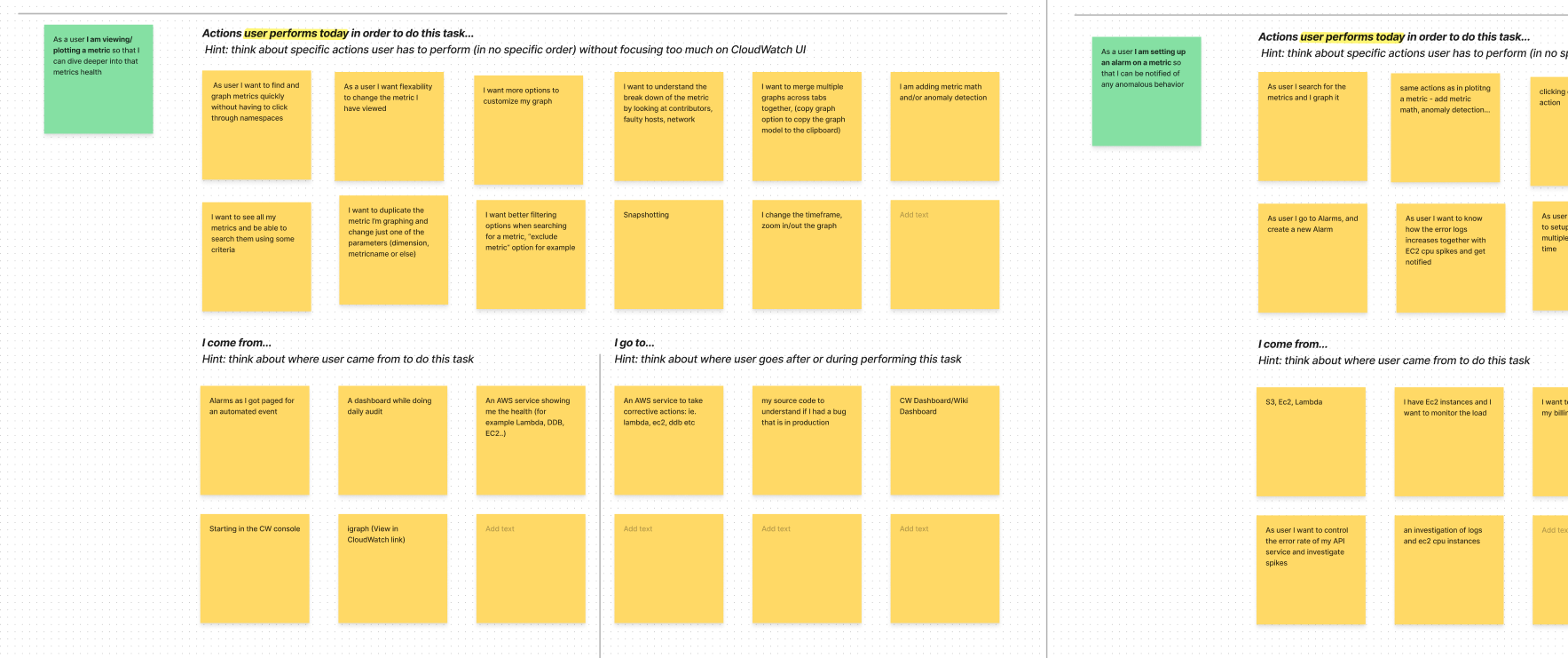
Identyfing the main workflows
Different ways of measuring with pros and cons
My initial idea was to do a survey followed by customer calls to dive deeper and understand more precisely what the users are struggling with. I wanted to run the survey in regular intervals, every 6 months, to track how the scores are changing and whether the work we're doing is actually improving the usability of these flows. However survey was a very manual process, it required a lot of approvals, analyzing the results and finding the customers to actually fill it in was time consuming and difficult. I wanted to find a way to automatize the feedback collection so I started exploring different options and talking with other teams.
I found out there was a new internal tool that was allowing us to easily customize the default feedback form in the console. The default one just had a text area allowing the user to leave their feedback about the product but we could extend that with the UX health questions. This sounded like a good way to speed up the data collection, but it could only be done on a page/service level and not on the task level. Basically we would always call the same form and based on the URL the user is coming from we would know which service they are leaving the feedback for. I combined the survey approach with the custom feedback approach for the best results, so we can look at scores on service level but also on the task level and compare results we are getting from the survey and the feedback.
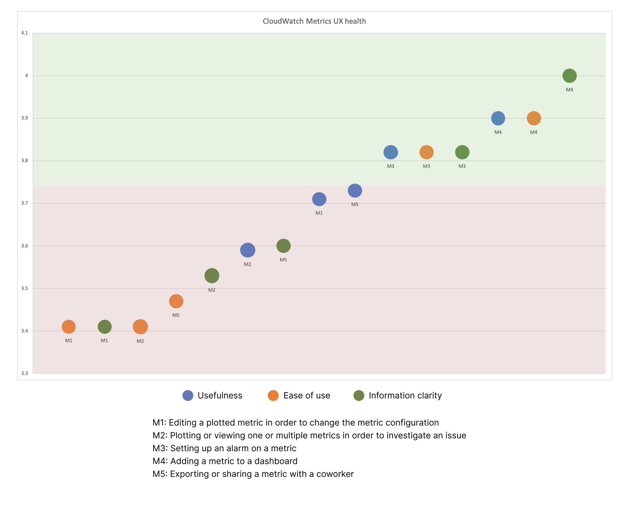
UX health scores for each workflow in Metrics UI
Discovering a new opportunity - understand how customers interact with the UI
While defining the measurement strategy I discovered a new gap we had - we didn't have a good way of tracking user engagement with the service (clicks and funnels). Our metrics were stored in a database that we could access only with the help of a developer and we didn't have dashboards or any way to quickly analyze the metrics to understand the adoption and general engagements with the service. I started digging and found another tool that we could onboard that would allow us to store all the metrics in the same place and give us the ability to generate reports.
However, this task required development support, as the interface had to be tagged with the right tags for it to work. I got an estimate from dev team and added this to the strategy doc to make it more rounded and to try to secure the capacity to get this work done. To make it easier for the developer I learned the tagging system and tagged the entire interface so it was just about manually adding the tags to the code and we were able to reduce the capacity so that we could fit the work into the next quarter.
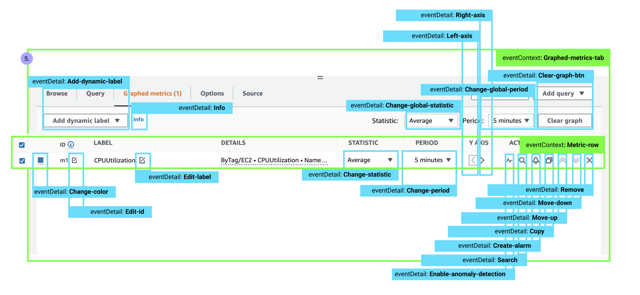
Tagging the UI
Deep dive to understand the "why"
I was able to recruit the customers for customer calls through the survey, but I didn't have many volunteers (15 registered their interest, but I was able to schedule only 5 calls). I already had too many tasks (5-7) for each of the top three services and I was short on time as the end of the quarter was getting nearer so I needed to speed things up in order to prepare my research report and share it with the stakeholders. Initially I was planning to do 5 customer calls for each area but finding the customers to participate was hard and I didn't have enough time so I had to narrow it down and focus on something more specific.
I decided to deep dive into the most painful tasks only (I got this info from the survey and the feedback from) and understand what are the issues with them so that we can prepare some proposals fast and address the most critical areas first to prove the value. Even though I didn't get to test each task, this worked very well in the end and with only 5 customer calls I was able to get to the bottom of the critical tasks and understand the issues users were facing.
Final results
Proposed improvements and a plan for the next quarter
I prepared a research report with a mix of quantitative and qualitative data for each user workflow and with some proposals for improvement. I was not focusing on big feature request but rather on small UX improvement we could make to those flows that would increase the overall user satisfaction with each. In parallel I worked on another one pager to make sure we keep the momentum going and continue the project in the next quarter and also scale it up to entire org. I wanted to keep on identifying the main workflows in other areas of CloudWatch, measure them, but also get the development capacity to tag the workflows so that we can start tracking metrics and funnels for each so that we can adopt the UX health metrics as out new KPIs. This project is still ongoing so I don't have any tangible results yet but we are prioritizing making the proposed improvements to the most critical workflows in the next quarter.
Key Learnings and Takeaways
- Always explore different options and understand pros and cons of each
- Involve the stakeholders and keep them engaged to get the buy in more easily
- Don't just focus on task at hand, but think big and see how you can scale up
- Start early and make the plan as detailed as possible
- Always have a tangible deliverable that you can get the stakeholder buy in more easily