Navigation and Discoverability
CloudWatch (AWS), year 2020
Fixing navigation issues and improving discoverability in a tool with many different sub-services
The challenge
Marketing tool or a navigation system?
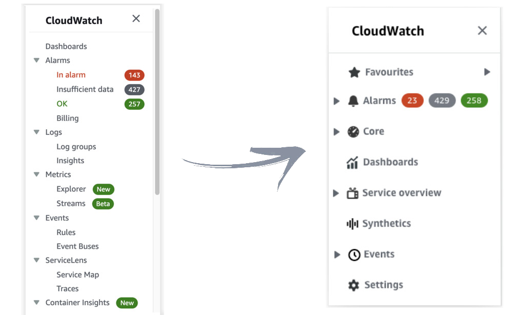
CloudWatch is a product used by DevOps engineers to monitor their applications. Over the course of the years the tool has been growing in size and more and more products have been added to it without a clear plan. All additional sub-services have been added to the left navigation menu for visibility as the most successful way to advertise a new feature was by putting it in the navigation and struggling to get the item above the fold. In the short time, this doubled the size of the navigation and made it really difficult for users to find what they were looking for.
There were three big challenges we faced:
- Creating an IA that works well for the customers but also stays in line with the business strategy
- Work across the org with many different stakeholders who see their sub-service as the most important one
- Unify the offering so that each sub-service doesn't feel like it is part of a different product
- proposing the initiative and getting the capacity for the UX team (4 UX designers)
- driving the initiative and organizing the workload among the team
- performing research and putting together research reports
- facilitating brainstorming sessions
- getting the stakeholder buy-in
- organizing and managing the timelines by bringing together 7 teams
My Role
The approach
Convince the stakeholders
When I joined CloudWatch after going through past research, reading through customer feedback and talking with the stakeholders I noticed that navigation was a big pain point - both for customers and for the stakeholders. Customers were finding it hard to navigate through CloudWatch and understand all the different offerings as they were not logically grouped and stakeholders knew this was a problem but didn't have any strategy in place to address it.
I collected all the data that was already available and put together a plan which I shared with stakeholders including capacity needed for the UX team to tackle this problem and understand better where the problem is in order to come up with a proposal. After getting the leadership buy in and approval it was time to deep dive.
Define research tasks and organize the team
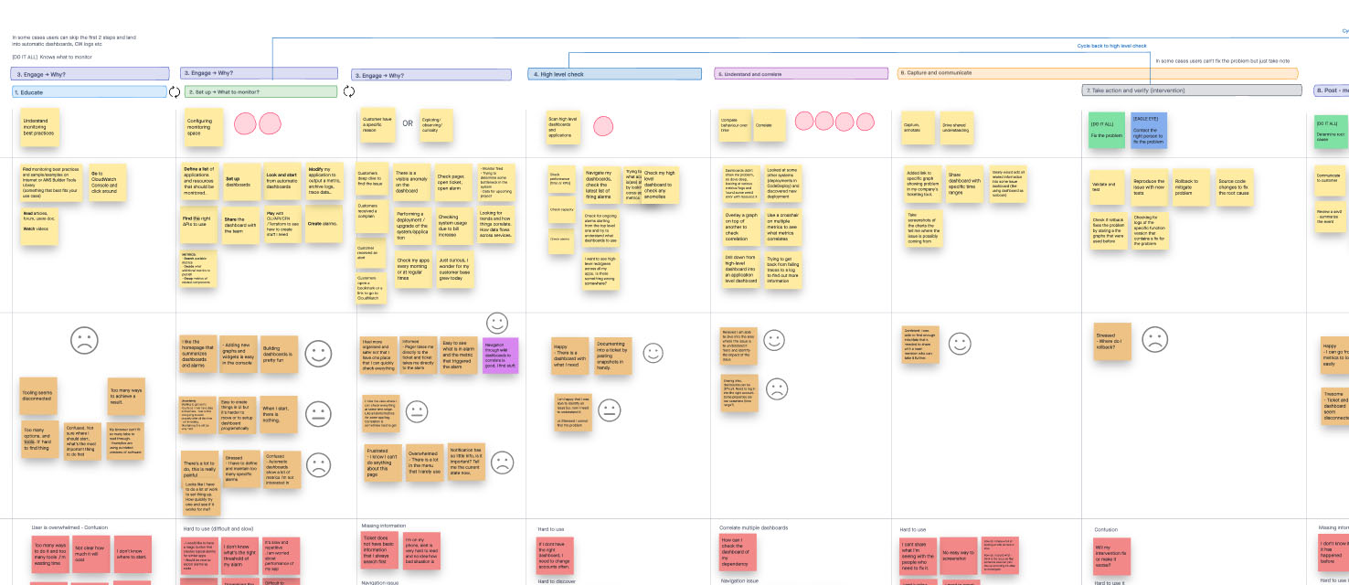
From customer feedback we knew that navigation was only one part of the problem so we needed to understand what else affects discoverability and focus on fixing those issues. Going through past research I realized we had some crucial gaps in our knowledge which we needed to fill in before we could proceed. Based on what we had and what was missing, I identified several research tasks we needed to perform in order to kick off the discovery phase.
User journey and archetypes
This was one of the areas I thought we had defined already but all the information we had was outdated so we needed to get back to the drawing board and do it fast. I proposed to do guerrilla research to spend the least amount of time on this task and only define the most essential user journey steps with pain points and most common archetypes in order to stay within the allocated time frames. I split the workload among the team so I focused on creating archetypes by talking with stakeholders and some internal customers, but relying a lot on past research and global AWS archetypes we had defined already. I did several workshops with internal customers and stakeholders to map out the user journey and then the team took over to validate each part with some more customers in order to finalize it.
Navigation survey
This one came up as a necessity after mapping out the user journey. It became obvious then that a lot of discoverability problems happen not only because navigation was poor, but also because the sub-services were not being connected well enough. This was a new learning for us and we wanted to quantify those findings and understand better what were the most important problems when it comes to navigation and discoverability in general. I created a survey to collect some quick data and it turned out that even though the menu was still the biggest pain point, correlation was another very important one that we have overlooked completely.
Card sorting - qualitative and quantitative
For the navigation itself we needed to understand what could be improved and how to group different offerings together. But doing just the quantitative card sorting wouldn't give us enough information as we needed to understand the "why" behind it. In order to come up with the menu items first we broke apart the entire console into many different tasks and asked the users to group them in moderated sessions. We then used those groups to create new menu items and I created an unmoderated card sorting test to gather more quantitative data.
user journey mapping
Synthesize and share the results to get visibility
I was responsible for synthesizing the results from all the different research initiatives. Each designer shared with me their reports and I opened a spreadsheet and started sorting out all the results into several common themes. This is when it became even more obvious that navigation was only one small part of the problem and users were struggling with many more things (from overwhelming UI, to no customization).
I ended up identifying 5 buckets of pain points with only one of them being Information Architecture, which was what we initially wanted to address. Even though I wanted us to stay focused on the IA I also saw a great opportunity to influence the future roadmap with newly discovered pain points. I did several presentations with different groups of stakeholders to show what we learned and to announce the plan and get them excited about participating in brainstorming sessions which I wanted to do next. At this point, we needed to explore different solutions and diverge.
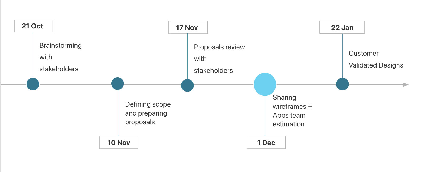
high level timeline to generate engagement
Brainstorming and roadmap
I organized several brainstorming sessions with the stakeholders to generate a lot of ideas for each of the 5 buckets and then decide which ones we want to focus on first. In order to narrow down the ideas we voted first and then prioritized the top voted ideas based on impact and feasibility. Some of our ideas were so big that they needed a separate content plan item, but some were qucik wins we could easily squeeze into the same release.
We wanted to do a little bit from each bucket for our MVP so I created a user story map to split ideas into releases to create a roadmap - in this stage, I worked closely with development team to understand the timelines and effort needed. I continued having conversations about IA and the rest of the team started working on designs for other ideas.
IA was the most complex one as we needed to align with product and leadership to make sure that the product strategy was taken into account. After several difficult conversation and many changes to the initial proposal I finally got the sign off for the IA and we were ready for development.
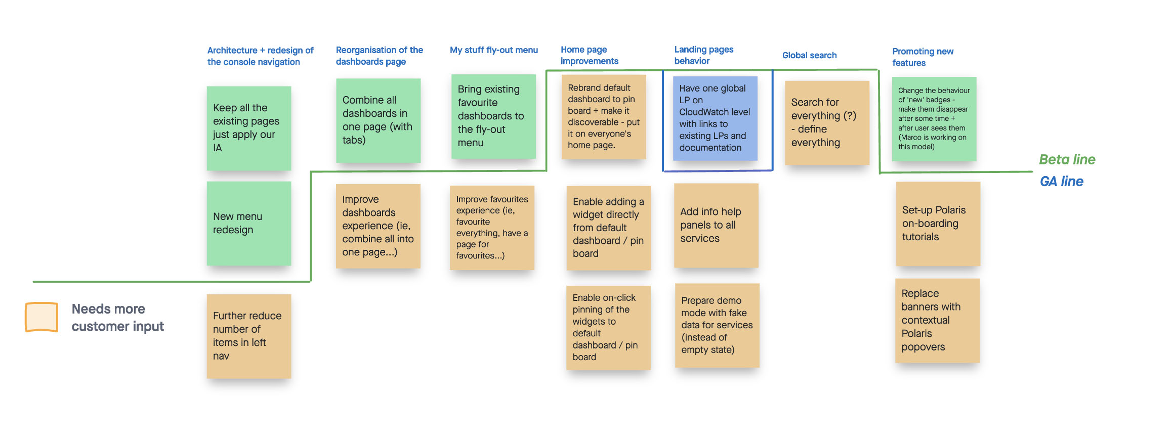
user story board with a list of improvements split into phases
Managing teams to deliver on time
I acted as PM on this project so I was responsible for the timelines and making sure the teams make changes to their product areas at the same time so we can release everything together. This involved 7 product and development teams. I had tasks and timelines in the doc for each team and even though, by then, most of them were familiar with what we were trying to do, there were still some questions and concerns being raised. So I took a step back and did a couple of more sharing sessions including those stakeholders to ensure them that our plan was well tested and we got all the necessary approvals.
Final results
Compact navigation, happy customers
The new menu was positively received which was reflected in the feedback we got through both the console and during customer calls:
"The new groups make much more sense and it's easier for me to find what I need. Also, I love having favorites at the top, it makes it a lot faster to access the stuff I use the most."
- We managed to reduce the height of the navigation by 50%
- With the improvements we made to the logic (remember which buckets were expanded vs collapsed) 80% of our customers were now seeing links to all the services they use above the fold
- We reduced the number of landing pages from 6 to one global landing page for the entire CloudWatch
- We made favorites more accessible by putting them at the top and separating them from the menu and enriching them with recently visited for quick access to most commonly used services
Key Learnings and Takeaways
This was a very challenging project because of the number of stakeholders involved and teams that needed to work together, but I definitely learned a lot:
- involve leadership early
- work together with stakeholders to show them their opinion matters
- have separate conversations with difficult stakeholders
- use quantitative data together with qualitative and always involve external customers in research
- focus on what's feasible and be flexible
- have a clear plan for the next phase and get commitment from the stakeholders